Side modal
Display critical information or introduce a decision to the right of the page content.
Consider using a side modal when the regular modal height (520 px) is not enough.
 View in Storybook
 View examples in Figma
Behavior
The side modal is displayed to the right of the viewport, and its appearance is animated from right to left. Clicking outside of the modal or closing it makes the modal disappear.
Scroll
If the height of the side modal cannot contain all of the content, the modal's header and footer stick to the top and bottom of the viewport, and the content area becomes scrollable.
Actions
- Hide the close icon in cases when the side modal content requires users to complete a specific action (for instance, edit or create).
- The footer is optional—consider hiding it when the side modal is view-only.
- Use the third action placeholder for the tertiary actions on the side modal content, such as Reset for filters.
Usage
Side modal comes in five standard widths:
- Size S – 440 px
- Size M – 600 px
- Size L – 760 px
- Size XL - 920 px
- Size 2XL - 1080 px
Choose the appropriate size based on the content you want to display. You can also use a custom width, but it cannot exceed 1200 px and should still follow our grid system.
Examples
View only
Filters
Creation
Edit
Form
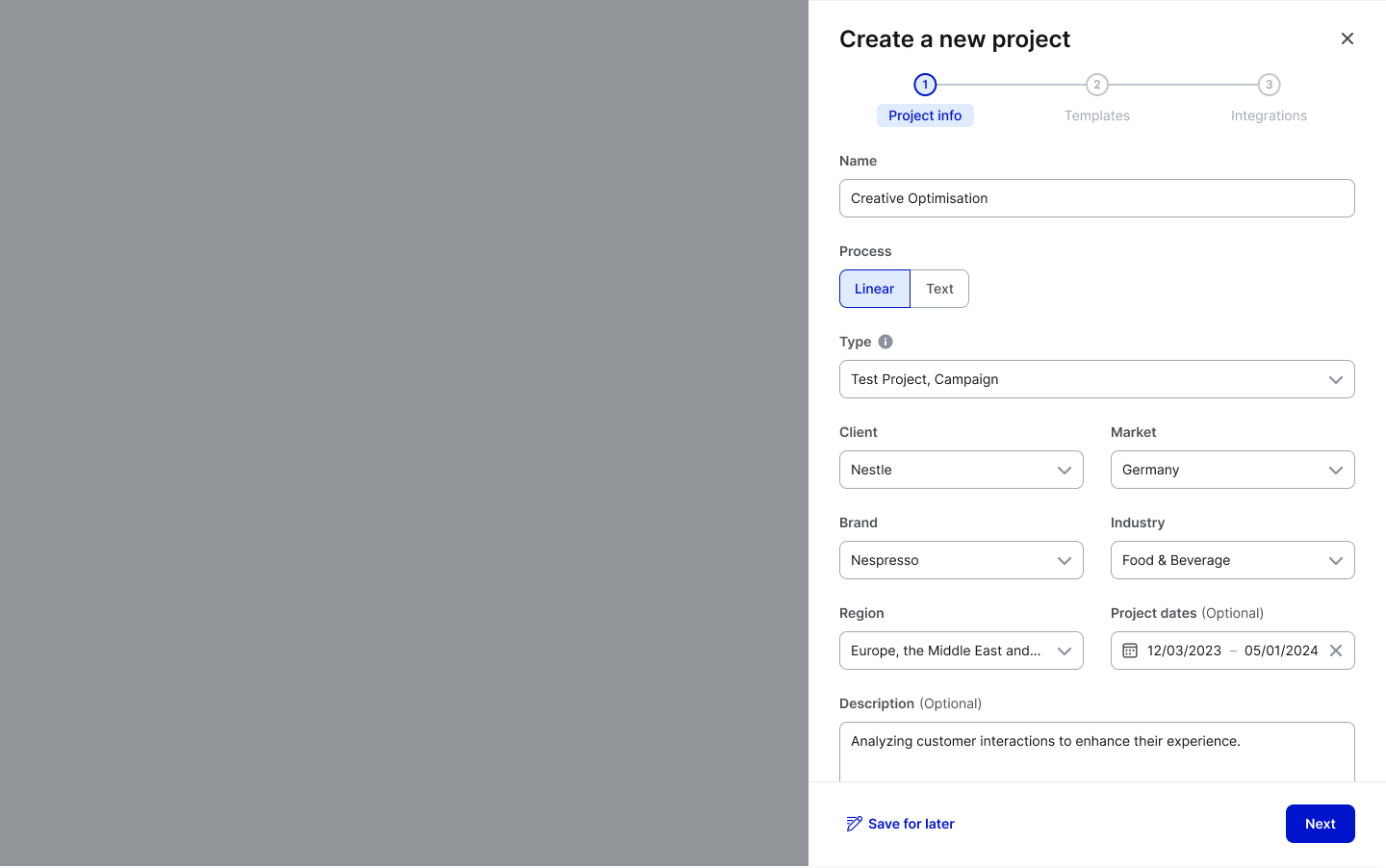
Stepper
Tabbed view
Accessibility
Keyboard focus
The keyboard focus activates actions and all interactive elements in the Side Modal window. The focus state in the Side Modal changes based on the element it is on.
Keyboard interactions
See ARIA Authoring Practice: Dialog (Modal) for more consideration on expected keyboard interactions. It covers roles, labels and properties as well.
Resources
Refer to Understanding 2.1.1 Keyboard for more information on expectations, intent, benefits, and techniques.