Version 2.7.0
Welcome to the WPP Open Design System v.2.7.0!
Resources
You can download icons, foundations, and components from the Open Design System v.2.7.0.
New WPP Open Theme
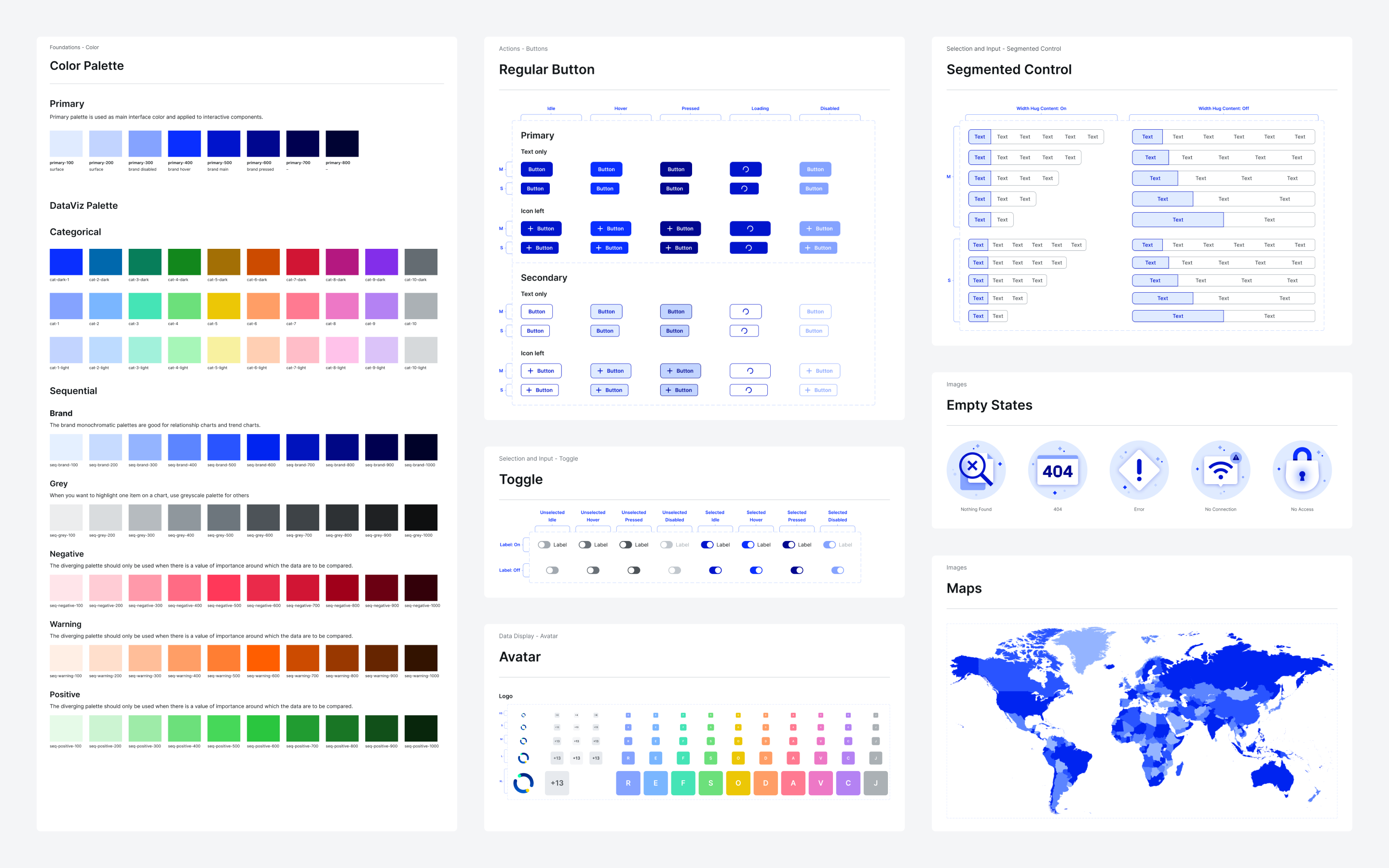
We're excited to unveil the new WPP Open Theme with revamped logos, colors, and typography. You can find the necessary assets in the v.2.7.0 resources.
important
Before upgrading your projects in Figma:
- Create timestamps in the Figma files.
- Start with a single file and upgrade components individually to ensure everything works correctly.

New component: Rich text editor
We're introducing Rich text editor, a WYSIWYG editor that presents content in a format that mirrors its final appearance, ensuring intuitive and true-to-life editing.
Extended Carousel: Gallery
We've introduced Gallery, a new Carousel variant that enables you to put more emphasis on displaying visual content.
Updates and improvements
- Autocomplete, Checkbox, Combined input, Counter, File upload, Input, Pill, Radio, Search, Select, Toggle: Changed the
border-colorvalue fromgrey/600togrey/500to reduce contrast. - Avatar: Removed the background from the icon Avatar variant.
- File upload: Visualized more types of uploaded items.
- Icons: Added a set of basic icons for points of interest on maps. This includes icons for food, drink, transport, and landmarks.
- Input: Introduced a number-only subtype for input fields that restricts input to numeric values. The new subtype has max and min character validation, an error state with customizable error messages, and masking to ensure that users input numeric values uniformly.
- Tooltip: Added support for
allowHTMLto enable HTML content within tooltips. - Tree shaking: Adjusted the Angular boilerplate configuration to enable effective tree shaking.
- Typography: Updated the WPP font in all typography H3 and larger to reflect changes in the default WPP Theme.
- Upgraded
node-sassto v.9.0.0 to address a known vulnerability. - Added the option to use a comma as a number separator in addition to the previously available dot.
Bug fixes
- Button: Addressed an issue where the loading state was displayed after rapidly clicking a disabled button multiple times in quick succession.
- Checkbox: Corrected the idle state color issue by setting the border color to
grey/500, and the background to transparent. - Combined input: Resolved an issue with empty input fields, addressing the following behaviors:
- In the idle state, the left-side
border-radiusis now0px. - In the active state, the border color is now
grey/800, ensuring consistency with the expected appearance.
- In the idle state, the left-side
- File upload: Fixed margin alignment issue with new icons for
.xlsand.xlsxformat files. - Input:
- Fixed issues where the error border was not displayed in the error state and the icon in the left slot was not shown in the disabled state.
- Resolved an issue where placeholders were not truncated consistently.
- Modal and Side modal: Addressed overflow issues that appeared when navigating between pages and re-entering modals.
- Popover: Fixed an issue where events were not functioning as expected.
- Select:
- Fixed an issue where activating the
withSearchproperty made the search field unclickable. - Resolved an issue where selects in Modals with limited space did not allow choosing the last option on the list.
- Addressed the issue where the
autoFocusproperty was not functioning within Side modals.
- Fixed an issue where activating the
- Theme Builder: Resolved instability issues with the color picker.
- Fixed an issue where the page would jump to the right after selecting Add app group in the Hierarchy tab of the WPP Open OS settings.