Configure no-code products
No-code apps are a group of applications that rely on the templates created in the Open OS. When creating no-code apps, product development teams use templates to wrap specific configs they provide into an app. In this context, “no-code” means that dev teams don’t need to develop or host apps on their side. This may be suitable for implementing standard functionality–for example, launching an app that wraps up an external or embedded link from the OS menu or a project.
No-code apps fall into six categories:
- Embedded code (for displaying content via an embed code).
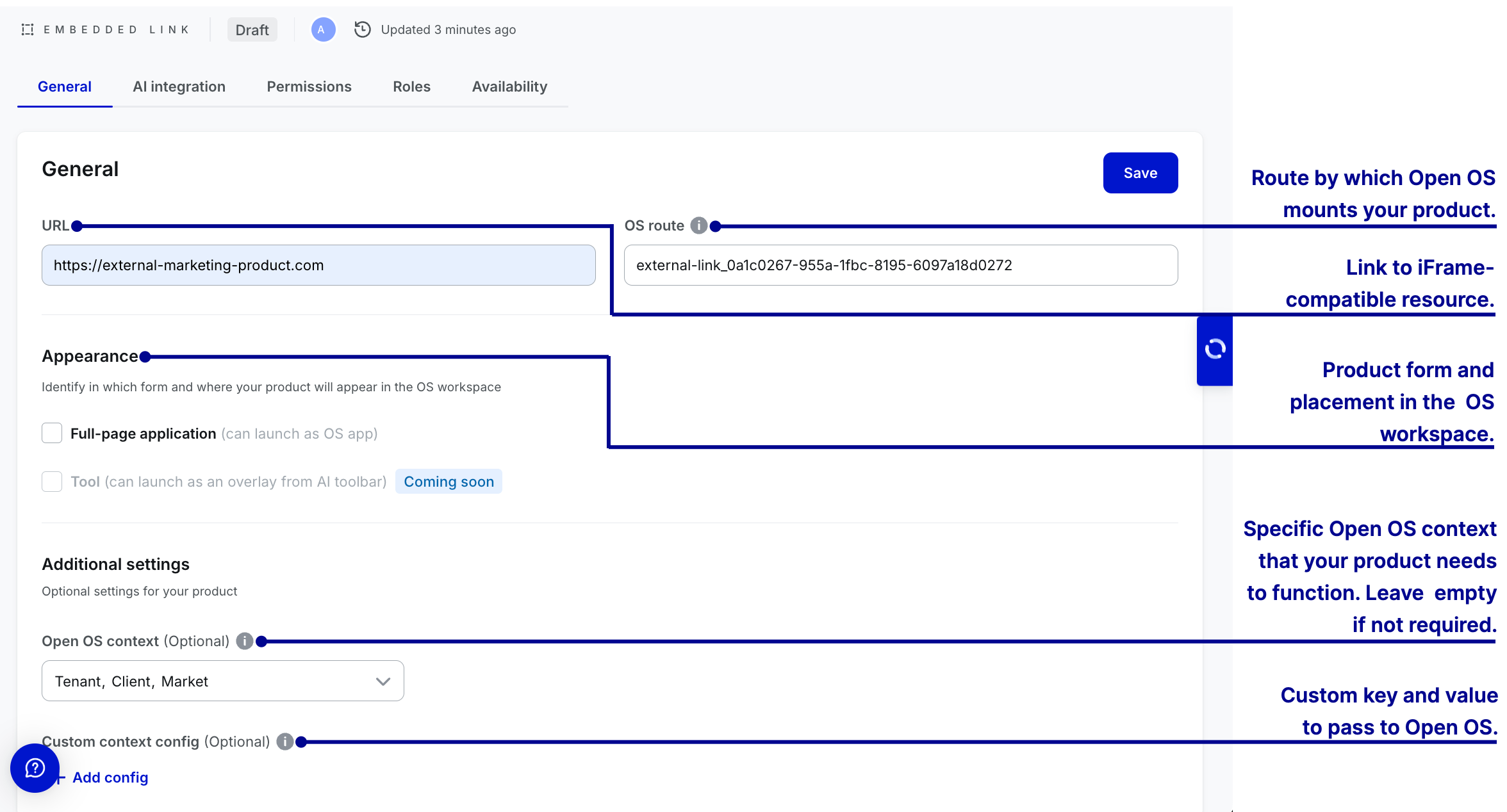
- Embedded link (for displaying iframe-compatible resources).
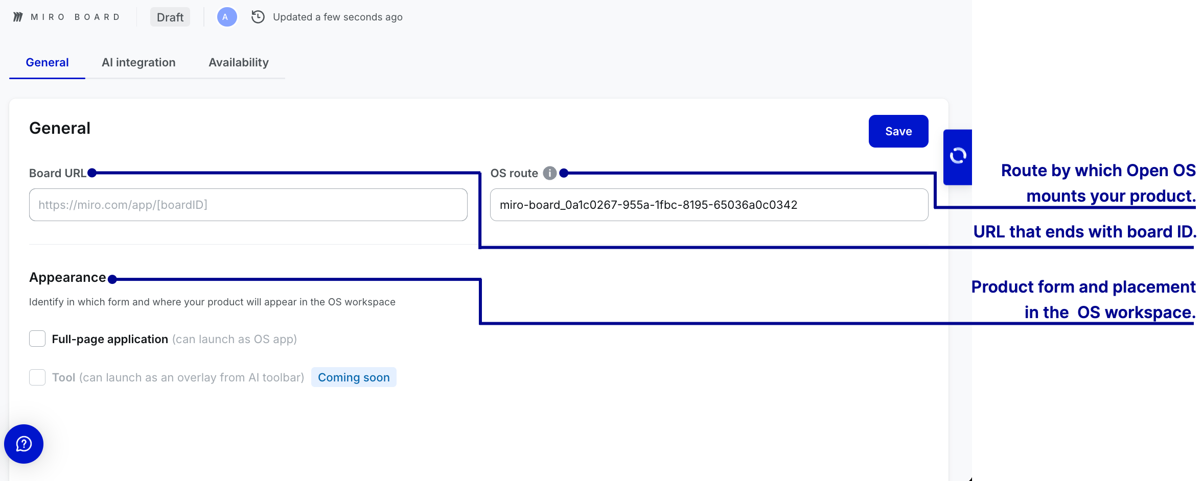
- Miro board (for embedding boards from Miro).
- External link (for linking to products outside of Open OS).
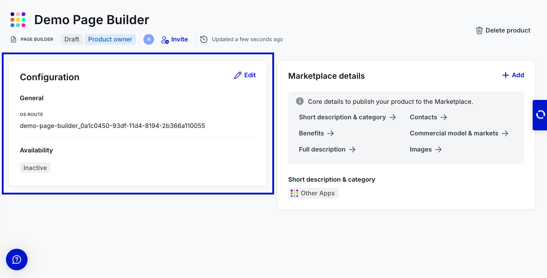
- Page builder (for creating a static page with customizable building blocks).
- Code upload (for uploading static websites and hosting them on Open OS).
In the following sections, we'll look at how to configure no-code apps.
While naming no-code apps, please follow the naming rules––within a workspace (tenant), no two no-code apps of the same type can have the same name, but different types can. However, across different workspaces, apps of the same type can share a name.
After a future Core release v6.4 in Q3, Workspace Admins will be able to use pre-built templates to create and deploy apps directly within workspaces. Templates will be available for the following types of no-code apps: External link, Embedded link, and Embedded code.
Configure no-code apps
Product configuration has to do with setting up the technical aspects of your product. These technical aspects depend on the type of no-code app, determining which fields should be filled on the product configuration page.
Fill in the general parameters
Each type of no-code app has a unique set of general settings. For successful product launch, make sure to fill out all of the required fields.
Embedded code

Embedded link
Create roles and permissions
Users can use DevHub to create roles and permissions for embedded links. Creating roles and permissions is optional. It allows granular access control within the applications, enabling developers and admins to define roles with associated permissions.
This improves application integration with the OS and lets workspace admins and project owners manage access control with ease.
Permissions are individual sets of parameters that dictate what users can access and do within your product. Ideally, permissions are very granular, with each focusing on specific features.
Roles are sets of permissions that operate within a predefined hierarchy. You can create roles based on the expected user structure and grant users access to specific points in your product without assigning them individual permissions.
Please take a look at our documentation on roles and permissions to get detailed insights.
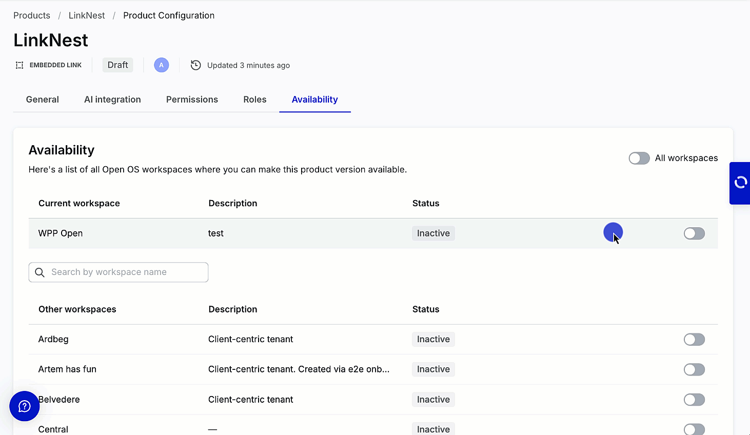
Enable availability
Users can enable the product to the current workspace––workspace where it's created and other workspaces from the Availability tab without creating roles and permissions.
In scenarios, where the roles and permissions are created, the roles should be assigned to the permissions and mapped to all OS meta roles––Owner, Contributor, and Viewer.
Handling OS contexts
When Open OS runs an embedded link, it waits for that product to request a connection. Once your embedded link connects to Open OS, it can access the
FullscreenAppContext object. FullScreenAppContext encapsulates workspace-specific data.
For detailed information on the key values of OS context, please take a look at our documentation on OS context key values explanation.
Products can query Alpha Zulu about user permissions either when launching the product from the project or from outside the project, for instance, through the hierarchy menu.
Please take a look at querying Alpha Zulu for app permissions for more details.
Roles and permissions for embedded app types work the same way as in native apps.
Miro board
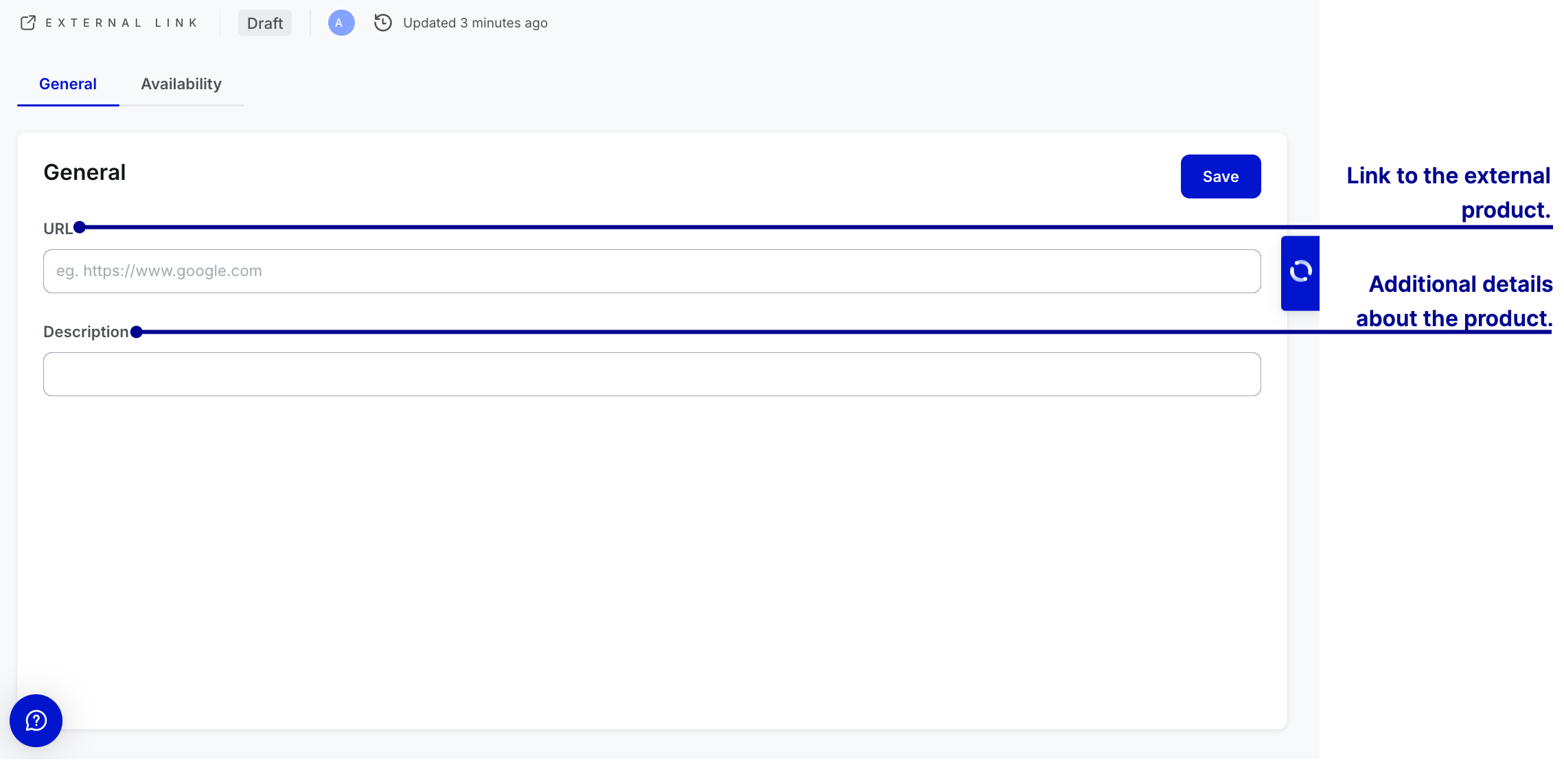
External link
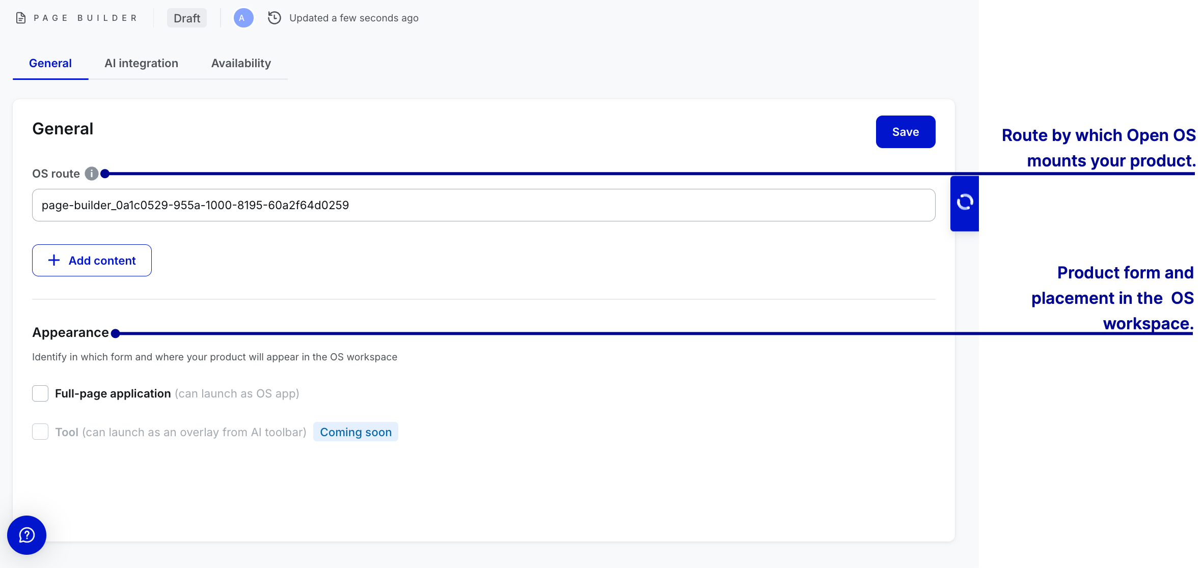
Page builder
To add customizable building blocks, select + Add content. The page editor with custom components will open.
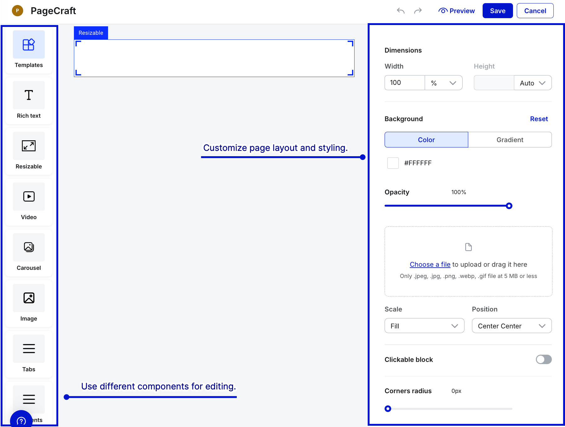
- To use any component, drag and drop it on canvas.
- Use templates with pre-defined components and layout to quickly create pages tailored to your needs.
- When editing, select Preview to see how the page looks. After you finish editing the page, select Save.
Now that you have an understanding of Page Builder, watch this video to see how all the features and capabilities work together to create custom pages.
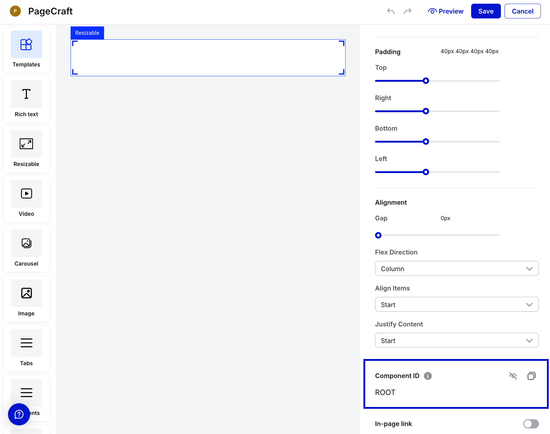
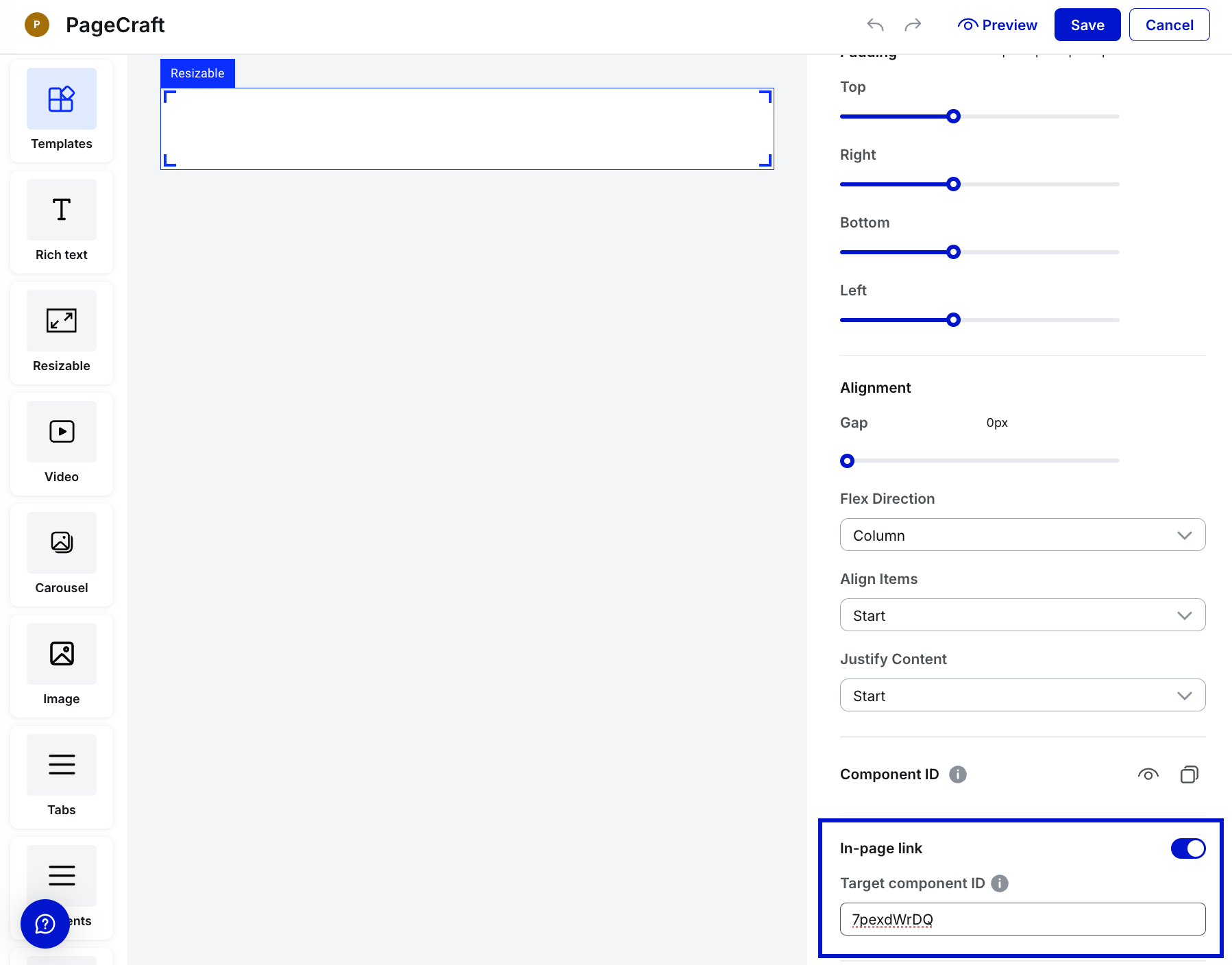
How to use anchors
Page Builder supports linking one component (e.g., Rich Text or Button) to another on the same custom page. This enables scrolling to the relevant content when the linked component is clicked.
To user anchors, do the following:
-
Select the target component—the component you want to link to.
-
Under the Component Settings panel on the right:
-
Locate the Component ID field at the bottom.
-
Click the Eye icon to show the component's ID.
-
Use the Copy icon to copy the ID. A brief "tick" icon confirms that the id is copied.
-
-
Select the component you want to link from—such as Rich Text or Button.
-
Under the Component Settings panel on the right:
-
Toggle In-page link to enable the functionality.
-
Paste the copied Target component ID into the Target component ID field.
-
Select Save.
-
Once configured, selecting the initial component will scroll the page to the target component.
Watch the following video for a detailed illustration of the concept discussed above—how to use anchors.
Code upload

After filling out the general settings fields of any no-code app, select Save.
AI integration
In the AI Integration tab, available for all no-code products except for External Link, you can add a technical description of your app to help the AI Assistant provide more accurate responses. You can also set default pre-prompts to enhance the AI's understanding and interaction with your app's functionality.
Initiate tenant availability
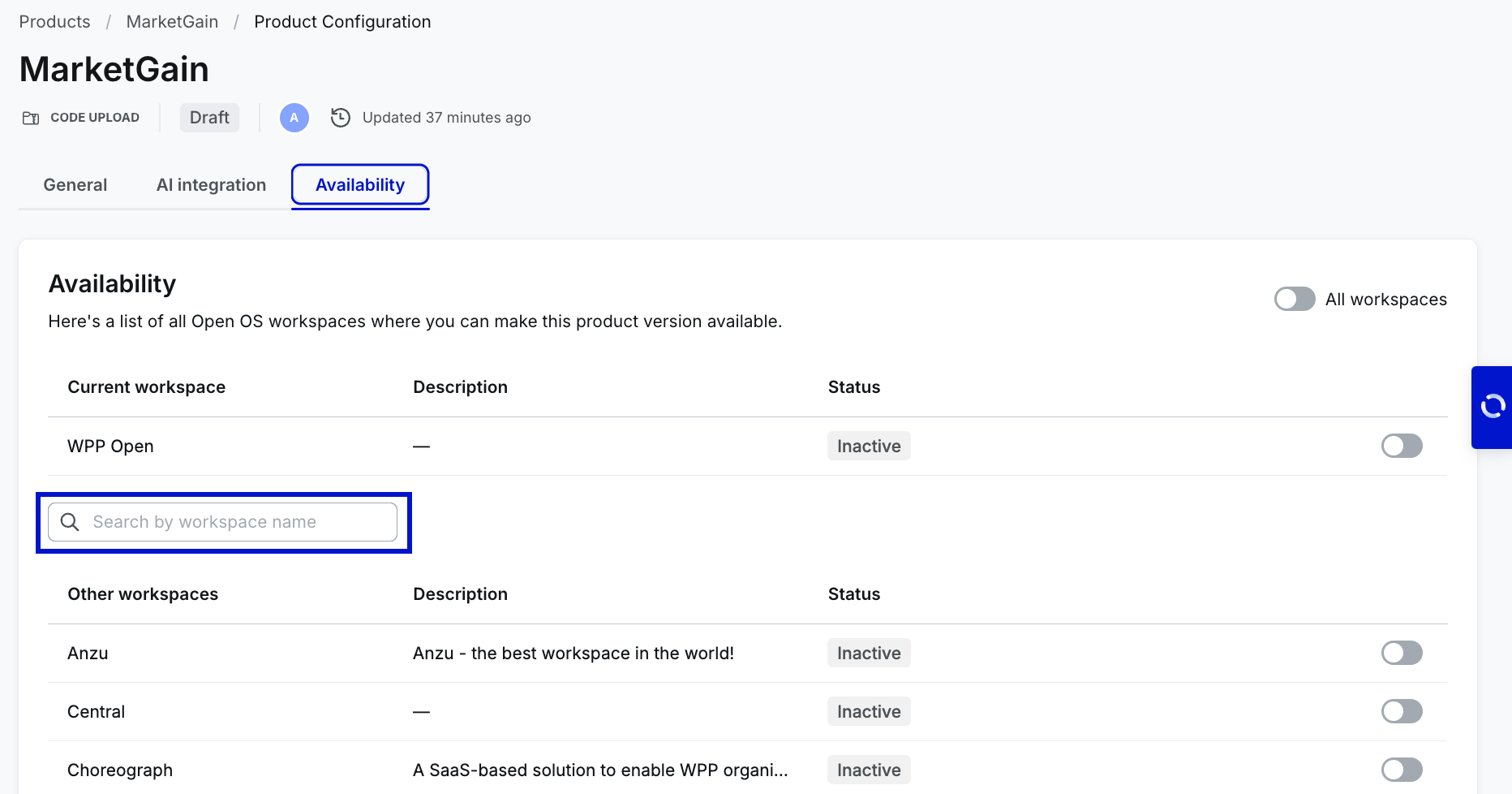
You can activate your product on the workspace (tenant) by turning on the toggle in the row with its name and description. Use the search bar to quickly find specific workspaces when configuring product availability in DevHub. Note that the search bar is visible only if the product can be activated on other workspaces. Search is performed on the list of "Other workspaces" based on the workspace name.
DevHub allows working on different aspects of product creation simultaneously. You can activate a no-code product on one or multiple workspaces without publishing it to Marketplace. WPP Open also supports the global availability toggle––Activate for all workspaces.
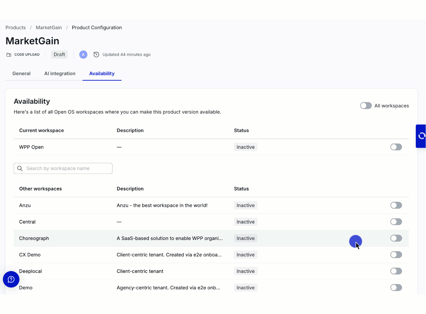
The product becomes available in the workspace's app list (in the admin panel) only when enabled for specific workspace.
Once you activate your product for specific workspaces, the admins of those workspaces can add it to the workspace navigation/hierarchy. While this means that your product won't automatically become available to the workspace users, we still encourage you to be attentive when setting up product availability. Consider activation to be the final step to onboarding your product to Open OS.
Deactivating products may disrupt existing business flows for specific workspaces. For this reason, we recommend deactivating products only when necessary and communicating your timelines to the existing users.