Developers
Welcome to the WPP Open Design System! If you're just starting to develop under the WPP Open Platform, check out Build native products document.
Open Design System enables you to develop apps with React, Angular, Vue.js, and pure JavaScript. Our components library exports the following packages:
@wppopen/components-library- Pure JavaScript web components and types.@wppopen/components-library-react- React bindings for web components.@wppopen/components-library-angular- Angular bindings for web components.@wppopen/components-library-vue- Vue.js bindings for web components.
The React and Angular packages provide a smooth development experience, similar to that of working with native framework elements. For some tips on using custom elements with frameworks, see Custom Elements Everywhere.
Set up the design system
-
Access the WPP Open GitHub and create a personal access token (
WPP_OPEN_GITHUB_TOKEN). -
In your product's root directory, create an
.npmrcfile and add it to your.gitignore. -
To
.npmrc, add the following lines:.npmrc@wppopen:registry=https://npm.pkg.github.com
//npm.pkg.github.com/:_authToken=${WPP_OPEN_GITHUB_TOKEN}
always-auth=true -
Install Open DS for your framework of choice.
Configure your framework
Open Design System offers a collection of reusable React, Angular, and pure JavaScript components to build web apps and user interfaces. Adoping our design system promotes consistency in markup, styles, and behaviour when prototyping and developing production-ready apps.
- React
- Angular
- Vue
- Web components
-
Install the following packages:
# npm
npm install @wppopen/components-library
npm install @wppopen/components-library-react

# yarn
yarn add @wppopen/components-library
yarn add @wppopen/components-library-react -
To your
src/index.html, add:src/index.htmlimport React from 'react';
import ReactDOM from 'react-dom';
import '@wppopen/components-library/dist/platform-ui-kit/wpp-theme.css';
import '@wppopen/components-library/dist/platform-ui-kit/global.css'
import App from './App';
import './index.css';
ReactDOM.render(<App />, document.getElementById('root')); -
To your
src/App.tsx, add:src/App.tsximport React from 'react';
import { WppButton } from '@wppopen/components-library-react';
import './App.css';
const App: React.FC = () => (
<div>
<WppButton>Test</WppButton>
</div>
);
export default App;
We provide additional bindings to make (ngModel) and reactive forms work out of the box.
-
Install the following packages:
# npm
npm install @wppopen/components-library
npm install @wppopen/components-library-angular

# yarn
yarn add @wppopen/components-library
yarn add @wppopen/components-library-angular -
To your
src/app.module.ts, add:src/app.module.tsimport { NgModule, CUSTOM_ELEMENTS_SCHEMA } from '@angular/core';
import { BrowserModule } from '@angular/platform-browser';
import { FormsModule, ReactiveFormsModule } from '@angular/forms';
import { ComponentLibraryModule } from '@wppopen/components-library-angular';
import { AppRoutingModule } from './app-routing.module';
import { AppComponent } from './app.component';
@NgModule({
declarations: [AppComponent],
imports: [BrowserModule, AppRoutingModule, ComponentLibraryModule],
providers: [],
bootstrap: [AppComponent],
schemas: [CUSTOM_ELEMENTS_SCHEMA],
})
export class AppModule {} -
To your
angular.json, add:angular.json"styles": [
"node_modules/@wppopen/components-library/dist/platform-ui-kit/wpp-theme.css",
"node_modules/@wppopen/components-library/dist/platform-ui-kit/global.css",
"src/styles.scss"
], -
To your
src/app.component.html, add:src/app.component.html<div>
<wpp-button>test</wpp-button>
</div>
-
Install the following packages:
# npm
npm install @wppopen/components-library
npm install @wppopen/components-library-vue

# yarn
yarn add @wppopen/components-library
yarn add @wppopen/components-library-vue -
To your
src/main.ts, add:src/main.tsimport { createApp } from 'vue';
import { ComponentLibrary } from '@wppopen/components-library-vue';
import '@wppopen/components-library/dist/platform-ui-kit/wpp-theme.css';
import '@wppopen/components-library/dist/platform-ui-kit/global.css';
// If you are running application in Standalone mode - don't forget to import theme
// import '@wppopen/components-library/dist/platform-ui-kit/wpp-theme.css';
import App from './App.vue';
const app = createApp(App);
app.use(ComponentLibrary);
app.mount('#app'); -
To your
src/App.vue, add:src/App.vue<script setup lang="ts">
import { WppButton } from "@wppopen/components-library-vue";
</script>
<template>
<WppButton>Test</WppButton>
</template>
-
Install the following packages:
# npm
npm install @wppopen/components-library

# yarn
yarn add @wppopen/components-library -
To your
src/index.html, add:src/index.html<!doctype html>
<html lang="en">
<head>
<script
type="module"
src="./node_modules/@wppopen/components-library/dist/platform-ui-kit/platform-ui-kit.esm.js"
></script>
<link
rel="stylesheet"
href="./node_modules/@wppopen/components-library/dist/platform-ui-kit/wpp-theme.css"
/>
<link
rel="stylesheet"
href="./node_modules/@wppopen/components-library/dist/platform-ui-kit/global.css"
/>
<meta charset="UTF-8" />
<title>Title</title>
</head>
<body>
<wpp-action-button>Click me!</wpp-action-button>
<wpp-button>Click me!</wpp-button>
<wpp-select placeholder="Placeholder" type="combined">
<wpp-select-option value="Car">Car</wpp-select-option>
<wpp-select-option value="House" disabled>House</wpp-select-option>
<wpp-select-option value="Apartment">Apartment</wpp-select-option>
</wpp-select>
</body>
</html>
Work with themes
Themes help you modify the Open Design System components' look and feel to fit your app's aesthetic.
Theming basics
Theming enables you to create products that share the same global style while maintaining flexibility when fine-tuning the more minor details. To achieve this, Open Design System uses a hierarchy of styling principles, including colors, typography, iconography, and more.
The following table will help you become familiar with the terms commonly used in theming.
| Term | Meaning |
|---|---|
| Theme | Set of global and component-specific styles for the app. |
| Global token | Identifier that assigns global styles across the app. |
| Component token | Identifier that assigns styles to specific components. |
| Value | Style assigned to a token, such as a color hex value. |
How our theming works
You can use the Open Design System to create standalone and OS-based apps. We differentiate between global and component-level tokens. By default, all components come in our light theme.
The Open Design System dark theme is currently under development—we will update the docs once it's released.
Component tokens share the same basic structure.
/* Elements in asterisks (e.g., [*modifier*]) are optional. */
--[wpp]-[component-name]-[*component-type*]-[style-name]-[*modifier*]

/* Example: */
--wpp-button-primary-bg-color-hover
To find the list of modifiable component tokens, look through the component docs under CSS Custom Properties.
Let's consider the <wpp-button> component styling, for example.
:host {
  --button-primary-bg-color: var(--wpp-button-primary-bg-color, var(--wpp-color-brand));
  ...

  button.primary {
      background-color: var(--button-primary-bg-color);
      ...
      }
}
You can see that the --button-primary-bg-color token has two different variables: --wpp-button-primary-bg-color and --wpp-color-brand. This allows you to define a fallback value—if the component-level variable --wpp-button-primary-bg-color is not provided, the global variable --wpp-color-brand will be used instead.
The Open Design System uses web components—a suite of different technologies that allow you to create custom HTML elements. Our design system uses the Shadow DOM at its core, which renders our components separate from the main DOM. So, when styling, you won't be able to select .wpp-button .wrapper p and will need to use CSS parts instead.
.wpp-autocomplete:part(dropdown) {
  ... list your styles here ...;
}
To find the list of modifiable parts, look through the component docs under Shadow Parts.
Component versioning
Since the Open Design System is in active development, many components are versioned, and their properties differ between releases. Considering this, you should base the selectors on component classes.
For example, let's consider the <wpp-button> component in the Open Design System v.1.1.1.
<wpp-button-v1-1-1 class="wpp-button disabled"> ... </wpp-button>
Which would make its CSS look something like this.
.wpp-button {
  ... any styles goes here ...;
}
OS-based vs standalone themes
Because you can use the Open Design System to develop standalone and OS-based apps, we provide styling approaches specific to the app type.
Style an OS-based app
To style a platform-based app, you need to fetch your app's theme from the WPP Open Platform database via its API. As a response, you will get a JSON containing the app theme, which looks similar to the following example.
{
  "version": 1,
  "settings": {
    "fontUrl": "https://fonts.googleapis.com/css2?family=Inter:wght@100;200;300;400;500;600;700;800;900"
  },
  "content": {
    "light": {
      "color": {
        "primary": {
          "100": "#EEE8FF",
          "200": "#DBD2FA",
          "300": "#CAB8FF",
          "400": "#8508E8",
          "500": "#5E00B5",
          "600": "#47039B",
          "700": "#2F0069",
          "800": "#0B001C"
        },
        "success": {
          "200": "#E0FAEA",
          "400": "#15803D",
          "500": "#11652F"
        },
        "warning": {
          "200": "#FDEAE2",
          "400": "#F15619",
          "500": "#C2410C"
        },
        "danger": {
          "200": "#FBE4E4",
          "300": "#F7CACA",
          "400": "#DF2F2F",
          "500": "#B91C1C",
          "600": "#921616"
        },
        "grey": {
          "100": "#F8F9FB",
          "200": "#F4F5F7",
          "300": "#E7EAEE",
          "400": "#C1C7CD",
          "500": "#A2A9B0",
          "600": "#8B919A",
          "700": "#697077",
          "800": "#4D5358",
          "900": "#343A3F",
          "1000": "#121619",
          "000": "#FFFFFF"
        },
        "highlight": {
          "200": "rgba(251, 241, 188, 0.4)",
          "400": "#F5DB58"
        },
        "brand": {
          "default": "color.primary.500",
          "disabled": "color.primary.300",
          "hover": "color.primary.400",
          "active": "color.primary.600"
        },
        "dataviz": {
          "cat": {
            "dark": {
              "1": "#8508E8",
              "2": "#934074",
              "3": "#B91C1C",
              "4": "#C2410C",
              "5": "#A16207",
              "6": "#4D7C0F",
              "7": "#15803D",
              "8": "#0E7490",
              "9": "#4F4FBD",
              "10": "#565C60"
            },
            "light": {
              "1": "#EED9FE",
              "2": "#EDD6EB",
              "3": "#FBE4E4",
              "4": "#FDEAE2",
              "5": "#FEF9C3",
              "6": "#D9F99D",
              "7": "#C2F5D4",
              "8": "#A5F3FC",
              "9": "#CCDCF8",
              "10": "#D9DCDE"
            },
            "neutral": {
              "1": "#BC71FB",
              "2": "#C880B2",
              "3": "#F87171",
              "4": "#F48052",
              "5": "#EAB308",
              "6": "#68A512",
              "7": "#1FBC59",
              "8": "#06B6D4",
              "9": "#7B90DF",
              "10": "#8F979D"
            }
          },
          "seq": {
            "brand": {
              "100": "#F3E6FE",
              "200": "#E6C9FD",
              "300": "#CE97FB",
              "400": "#B561FA",
              "500": "#9E30F8",
              "600": "#8508E8",
              "700": "#6A06BB",
              "800": "#4E058A",
              "900": "#35035E",
              "1000": "#19022C"
            },
            "grey": {
              "100": "#ECEDEE",
              "200": "#D9DCDE",
              "300": "#B6BBBF",
              "400": "#8F979D",
              "500": "#6D767D",
              "600": "#4D5358",
              "700": "#3E4347",
              "800": "#2D3134",
              "900": "#1F2123",
              "1000": "#0E0F10"
            },
            "negative": {
              "100": "#FBE4E4",
              "200": "#F7CACA",
              "300": "#F09999",
              "400": "#E86464",
              "500": "#DF2F2F",
              "600": "#B91C1C",
              "700": "#921616",
              "800": "#6F1111",
              "900": "#4B0B0B",
              "1000": "#230505"
            },
            "warning": {
              "100": "#FDEAE2",
              "200": "#FBD5C5",
              "300": "#F8AA8C",
              "400": "#F48052",
              "500": "#F15619",
              "600": "#C2410C",
              "700": "#9A320A",
              "800": "#732607",
              "900": "#4D1905",
              "1000": "#260D02"
            },
            "positive": {
              "100": "#E0FAEA",
              "200": "#C2F5D4",
              "300": "#84EBAA",
              "400": "#47E17F",
              "500": "#1FBC59",
              "600": "#15803D",
              "700": "#11652F",
              "800": "#0D4F25",
              "900": "#093519",
              "1000": "#041A0C"
            }
          }
        },
        "white": "color.grey.000"
      },
      "border": {
        "radius": {
          "xs": "4px",
          "s": "6px",
          "m": "8px",
          "l": "12px",
          "xl": "20px",
          "round": "64px"
        },
        "width": {
          "s": "1px",
          "m": "2px",
          "l": "3px"
        }
      },
      "boxShadow": {
        "xs": "0px 1px 4px 0px rgba(52, 58, 63, 0.12)",
        "s": "0px 0px 1px 0px rgba(52, 58, 63, 0.1), 0px 1px 5px 0px rgba(52, 58, 63, 0.1)",
        "m": "0px 1px 4px 0px rgba(52, 58, 63, 0.05), 0px 4px 12px 0px rgba(52, 58, 63, 0.12)",
        "brand": "0px 4px 12px 0px rgba(94, 0, 181, 0.3)",
        "l": "0px 8px 32px 0px rgba(52, 58, 63, 0.05)"
      },
      "font": {
        "family": "Inter"
      },
      "icon": {
        "color": {
          "default": "color.grey.600",
          "disabled": "color.grey.400",
          "hover": "color.grey.800",
          "active": "color.grey.900"
        }
      },
      "text": {
        "color": {
          "default": "color.grey.1000",
          "whiteInfo": "color.grey.200",
          "disabled": "color.grey.500",
          "danger": "color.danger.500",
          "warning": "color.warning.500",
          "success": "color.success.500",
          "info": "color.grey.800"
        }
      },
      "surface": {
        "bgColor": "color.grey.100"
      },
      "overlay": {
        "bgColor": "rgba(77, 83, 88, 0.6)"
      },
      "typography": {
        "5xl": {
          "display": {
            "fontFamily": "Inter",
            "fontSize": "48px",
            "fontWeight": "600",
            "letterSpacing": "0px",
            "lineHeight": "62px"
          }
        },
        "4xl": {
          "display": {
            "fontFamily": "Inter",
            "fontSize": "36px",
            "fontWeight": "600",
            "letterSpacing": "0px",
            "lineHeight": "48px"
          }
        },
        "3xl": {
          "heading": {
            "fontFamily": "Inter",
            "fontSize": "28px",
            "fontWeight": "600",
            "letterSpacing": "0px",
            "lineHeight": "40px"
          }
        },
        "2xl": {
          "heading": {
            "fontFamily": "Inter",
            "fontSize": "24px",
            "fontWeight": "600",
            "letterSpacing": "0px",
            "lineHeight": "32px"
          }
        },
        "xl": {
          "heading": {
            "fontFamily": "Inter",
            "fontSize": "20px",
            "fontWeight": "600",
            "letterSpacing": "0px",
            "lineHeight": "32px"
          }
        },
        "l": {
          "strong": {
            "fontFamily": "Inter",
            "fontSize": "18px",
            "fontWeight": "600",
            "letterSpacing": "0px",
            "lineHeight": "28px"
          },
          "midi": {
            "fontFamily": "Inter",
            "fontSize": "18px",
            "fontWeight": "500",
            "letterSpacing": "0px",
            "lineHeight": "28px"
          },
          "body": {
            "fontFamily": "Inter",
            "fontSize": "18px",
            "fontWeight": "400",
            "letterSpacing": "0px",
            "lineHeight": "28px"
          }
        },
        "m": {
          "strong": {
            "fontFamily": "Inter",
            "fontSize": "16px",
            "fontWeight": "600",
            "letterSpacing": "0px",
            "lineHeight": "24px"
          },
          "midi": {
            "fontFamily": "Inter",
            "fontSize": "16px",
            "fontWeight": "500",
            "letterSpacing": "0px",
            "lineHeight": "24px"
          },
          "body": {
            "fontFamily": "Inter",
            "fontSize": "16px",
            "fontWeight": "400",
            "letterSpacing": "0px",
            "lineHeight": "24px"
          }
        },
        "s": {
          "strong": {
            "fontFamily": "Inter",
            "fontSize": "14px",
            "fontWeight": "600",
            "letterSpacing": "0px",
            "lineHeight": "22px"
          },
          "midi": {
            "fontFamily": "Inter",
            "fontSize": "14px",
            "fontWeight": "500",
            "letterSpacing": "0px",
            "lineHeight": "22px"
          },
          "body": {
            "fontFamily": "Inter",
            "fontSize": "14px",
            "fontWeight": "400",
            "letterSpacing": "0px",
            "lineHeight": "22px"
          }
        },
        "xs": {
          "strong": {
            "fontFamily": "Inter",
            "fontSize": "12px",
            "fontWeight": "600",
            "letterSpacing": "0px",
            "lineHeight": "20px"
          },
          "midi": {
            "fontFamily": "Inter",
            "fontSize": "12px",
            "fontWeight": "500",
            "letterSpacing": "0px",
            "lineHeight": "20px"
          },
          "body": {
            "fontFamily": "Inter",
            "fontSize": "12px",
            "fontWeight": "400",
            "letterSpacing": "0px",
            "lineHeight": "20px"
          }
        },
        "2xs": {
          "strong": {
            "fontFamily": "Inter",
            "fontSize": "10px",
            "fontWeight": "700",
            "letterSpacing": "5%",
            "lineHeight": "20px",
            "textTransform": "uppercase"
          }
        }
      }
    }
  }
}
Internally, the WPP Open OS resolves this object and transforms it into a list of standard CSS variables.
--wpp-border-radius-l: 12px;
--wpp-border-radius-m: 8px;
--wpp-border-radius-round: 64px;
--wpp-border-radius-s: 6px;
--wpp-border-radius-xl: 20px;
--wpp-border-radius-xs: 4px;
--wpp-border-width-l: 3px;
--wpp-border-width-s: 1px;
--wpp-box-shadow-brand: 0px 4px 12px 0px rgba(94, 0, 181, 0.3);
Let's consider the same example we looked at when styling standalone apps: the background color of ActionButton.
To style this property, you want to update the theme.json associated with your workspace. This requires you to change the variable formatting to camelCase and specify it in the components property.
{
  "version": 1,
  "settings": {
    "fontUrl": "https://fonts.googleapis.com/css2?family=Inter:wght@100;200;300;400;500;600;700;800;900"
  },
  "content": {
    "light": {
      "color": {
        ...
      },
      "boxShadow": { ... },
      "components": {
        "actionButton": {
          "bgColor": "red"
        }
      }
    }
  }
}
Style a standalone app
To style a standalone app, add the following lines to your app's <head> tag.
<!-- Include the default WPP theme (light). -->
<link
  rel="stylesheet"
  href="./node_modules/@wppopen/components-library/dist/platform-ui-kit/wpp-theme.css"
/>
Let's consider styling the ActionButton component, for example. First, you need to find the available component tokens in its Storybook notes. In our case, let's take --wpp-action-button-bg-color, which is responsible for the component background color.
To style the component, in its respective CSS file, specify the necessary value.
body {
  --wpp-action-button-bg-color: red;
}
Using this approach, you can style every component in the Open Design System.
Pull component libraries into CI/CD pipeline
This section explains how application development teams can pull component libraries from WPP Open GitHub to their CI/CD pipelines. It includes the following scenarios while accessing the packages:
- How individual developers use Okta and personal access tokens to get access to packages.
- How CI/CD teams get access to packages using GitHub actions.
Use Okta and personal access token
- Login to your WPP Open GitHub account using WPP Okta credentials.
- Search for the repository hosting the package you are looking for.
- Select the your user icon on the top-right corner.
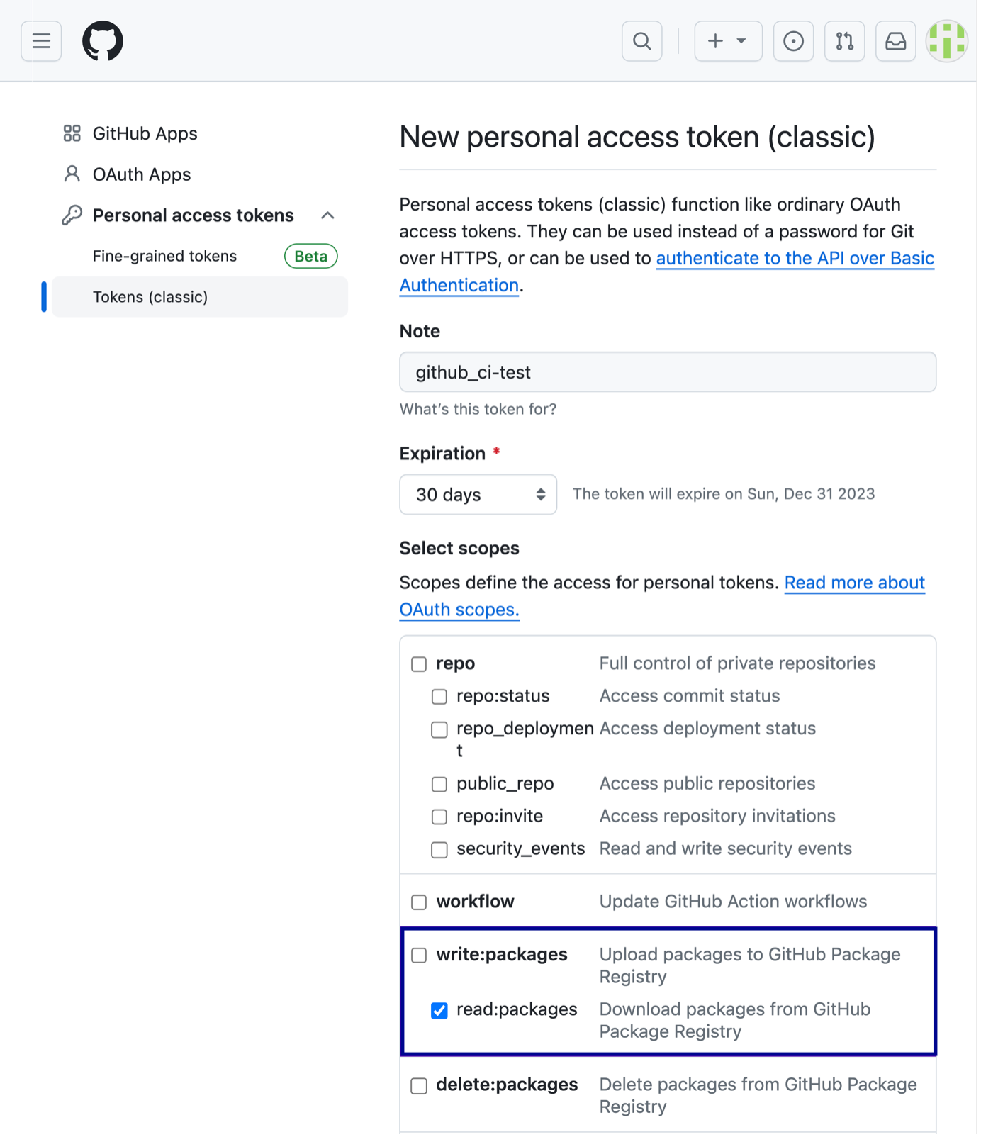
- Select Settings > Developers settings > Personal access tokens > Tokens classic > Generate new token dropdown > Generate new token (classic).
Personal access tokens (classic) function like ordinary OAuth access tokens. They can be used instead of a password for Git over HTTPS or can be used to authenticate to the API over Basic Authentication. –– GitHub Documentation.
-
Name your token in the Note field and select token expiration day on the Expiration dropdown.
-
On Select scopes, select read:packages––allows you to download packages from GitHub package Registry.
The Scopes define the access for personal tokens.
- Select Generate token.
Authenticate using personal access token��
You must use a personal access token (classic) with the appropriate scopes to read and install packages in GitHub Packages. Please follow GitHub documentation on how to authenticate using personal access token.
Use GitHub Actions
WPP DevOps team uses GitHub actions to allow CI/CD teams to read the component library. GitHub actions allow you to pick repositories that can read a package from another repository.
Only administrators of the repositories hosting the packages have the permissions to perform the actions listed below.
To allow access to packages
- Go to the repository hosting the package you are looking for.
- Go to Packages > Package settings > Add Repository in Manage Actions access.
- Select a repository from a list of repositories that can access the packages and select Add Repository.
In the Manage Actions access, you can find the newly added repository having the default ‘Read’ access role.
- You can select the Choose role dropdown to assign a Read, Write or Admin role to a repository.