Version 3.1.0
Welcome to the WPP Open Design System v.3.1.0! This release introduces updates and bug fixes to our components library. Read on to learn more!
Resources
You can download icons, foundations, and components from the Open Design System v.3.1.0.
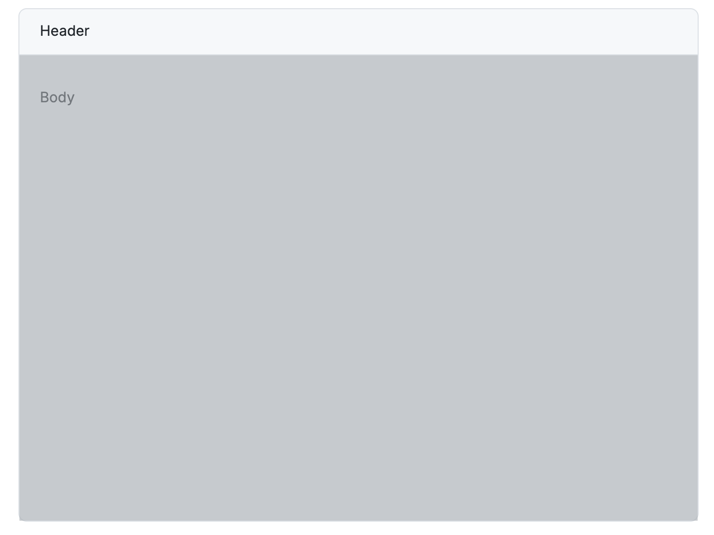
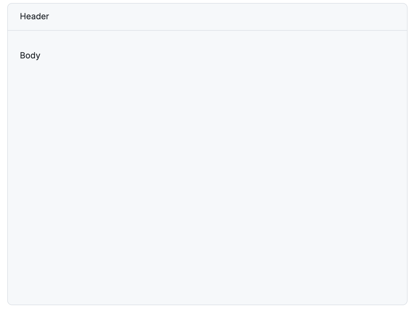
New component: Overlay
Introduced a new component—Overlay. It’s a coloured overlay with position as absolute—to cover the entire width and height of its parent element. It uses the wpp-grey-colour-500 with 60% opacity, matching the existing modal overlays.
Overlay on
Overlay off
Deprecations
-
Skeleton: Deprecated the
animationproperty—meaning, the Skeleton component's animation is now always on. There's no longer a way to disable it. -
Tag: Deprecated the
categoricalColorIndexproperty. Usevariantinstead.
Updates and improvements
Development specific
-
Theme: Updated the default WPP theme with new colours.
-
Chat: Created a new variant of the chat component, which is simpler, can be minimised and maximised.
-
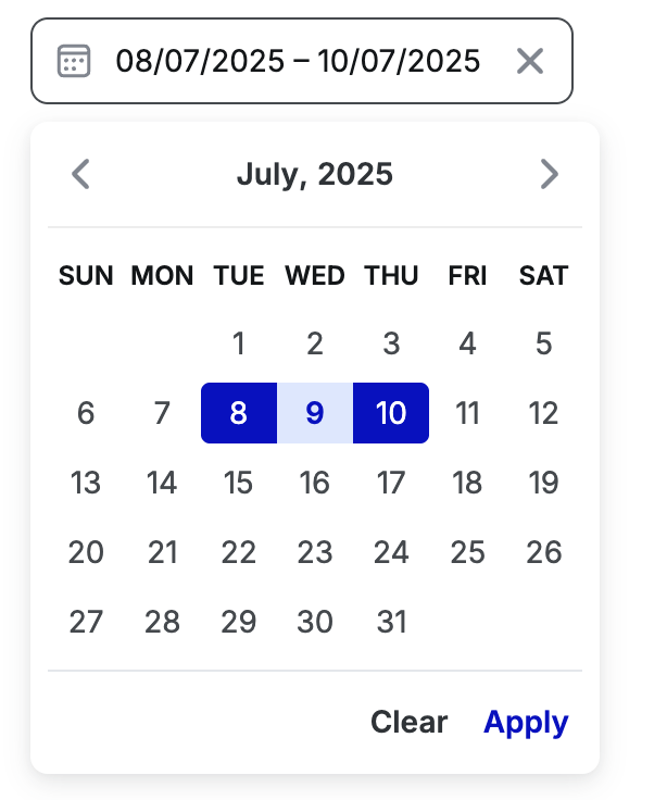
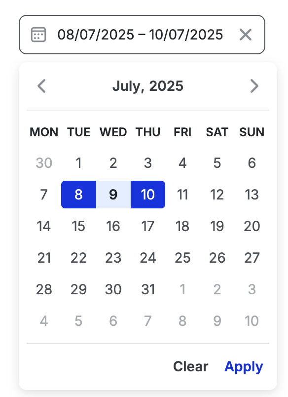
Date-picker: The datepicker UI has been updated to always render with a fixed height. All variants now consistently display 6 rows in the calendar, including days from adjacent months.
-
Input: Added a new property—defaultValue — to the Input component that allows users to set an initial value for the input when it is uncontrolled.
-
Custom select: Improved the integration between WppPopover and WppSelect within the custom select component to make it easier for users to customise dropdown content.
-
Toast, Inline message: Updated the info variant of the Toast and Inline message components to use a grey-200 for the background and grey-700 for their icons.
-
Spinner: Aligned the following colours of the spinner component to its Figma design:
- wpp-primary-color-500
- wpp-grey-color-800
- wpp-grey-color-000
-
Logo: Introduced a Reddit logo.
-
Tag: Updated the control of Tag “variant” in Storybook to use a dropdown with only valid options.
Figma libraries
-
Chat: Created a new variant of the chat component, which is simpler, can be minimised and maximised.
-
Card: Expanded the Card component's capabilities to support embedded graphs.
-
Table header: Enhanced the Table header component to support multi-line and second-line content, to accommodate more complex header scenarios.
-
File upload: Added examples of the error states.
-
Logo: Introduced a Reddit logo.
-
List item: Resolved an issue with the list component's background for the "Selected" state to correctly resize to 200px when a menu component is present.
Bug fixes
Development specific.
-
Select: Fixed an issue in the multiple select to make sure that the dropdown doesn’t close unexpectedly when users click a list item.
-
CL: Achieved WCAG AA accessibility compliance for the following components:
-
Inline message: Resolved an issue with the Inline message to ensure that even if a title is missing, the inline message with size L aligns properly with buttons and icons.
-
Slider: Updated the Slider component to pass down size properties to the inputs.
-
Stepper: Fixed the Stepper component—now the tooltip appears when hovering over the icon instead of being always visible.
-
Side modal: Fixed the following issues with the Side modal:
-
Forms now submit properly when the submit button is pressed, whether the form contains a Side Modal or a Side Modal is inside a form.
-
Actions are aligned to the right when the "slots" tag is used to render actions in a side-modal.
-
-
Popover: Fixed the issue where the popover closed unexpectedly. It now works as expected when a user selects an item from a dropdown inside a popover.
-
Date picker: Fixed an issue with the Datepicker inside a side modal. The calendar now appears above the side modal, making it interactable for users.
-
Autocomplete: Updated the placeholder colour to rgb(105.112.119) to match its Figma design.
-
List item: Fixed the tooltip visibility when wpp-list-item's label content changes dynamically. Now it appears for newly truncated text and doesn’t appear for non-truncated text.
-
Single select, AG Grid table, Pagination: Gaps in between items in dropdown lists of the components Single select, AG Grid table, Pagination are aligned to their corresponding Figma design.
-
Text select: Aligned the colour of the disabled and filled state of the Text select component to its Figma design:
-
Disabled state: wpp-grey-color-500
-
Filled state: rgb(18, 22, 25)
-